Required question: Choose a project that you felt was challenging but yet successful. The project should incorporate innovative solutions to the artistic problem given to you. Discuss how you generated innovative/original/creative ideas for the project and how you developed them to complete your final piece. Explain why you chose this piece. How did you think outside the box and challenge yourself as well as the restraints of the project.
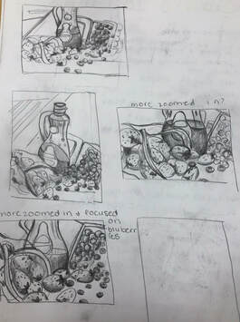
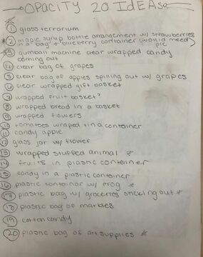
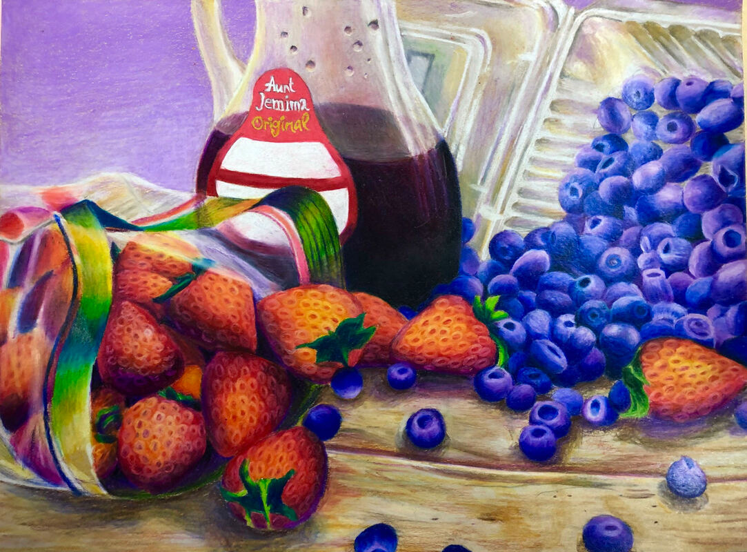
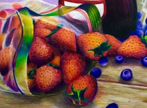
I felt that one project that was very challenging was my opacity drawing. I had a LOT of difficulty doing the details on that project, and when I tried to do it, it would take veryy long to do a small portion. Especially in each blueberry, one would take me like ten minutes so working on like six would take an hour, and it wouldn't show much progress and would unmotivate me. To try to be more creative and original, for this piece I wanted to make my own still life/ arrangement of things, so I did strawberries, blueberries, and some maple syrup. I also tried to really really push the colors I was seeing in the drawing, especially since I had such a crappy ref photo taken at 5 AM in the morning bc that's when we had to start working on them. Another problem I had was motivation. Since this project took such a long time to get a small area done, I often got really unmotivated and tired of working on it very quickly. I found it hard to show opacity in this drawing but I think in the end, I was able to do it. This project was a really challenging for me to try to portray opacity. Even though that's what the whole project was about, I still think I could have done a better job. Using very bright and vibrant colors distracts the viewer from the bad opacity especially in the strawberry bag ;)
|
|
|
3. Reflect on what your portfolio may or may not reveal about you during the semester. Do you think the work in your portfolio is an accurate reflection of your development in the class?
I feel like my work is a very accurate depiction of me during the semester. Because I was taking two art classes at the same time, I was doing art a LOT. I think it allowed me to improve a lot during the semester. I am very grateful. When I first came into this class, I didn't really know how to use prisma colors that well, or how to shade well or show light. Throughout the semester I got to use them a lot and learned how to use them. Yes I still make mistakes and sometimes push to hard with the colored pencil, but I know how to apply layers and stuff now.
|
|
4. Choose two mini lessons that you felt were the most beneficial to your learning for what particular project. Include photos of these and explain thoroughly. Do you feel like you needed more instruction for success? Explain or did you feel that the instruction given was enough to ensure success.
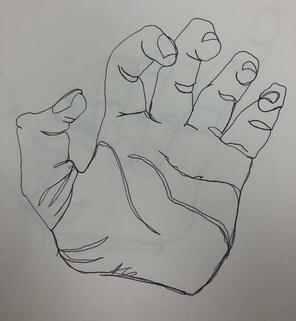
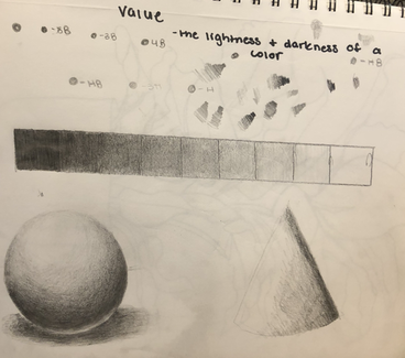
Two mini lessons I feel that were beneficial to learn was the contour hands mini project and the value charts. The contour hands really helped me practice really looking and drawing from life. To try to follow the lines with your pencil with the lines that you see. I feel like doing this mini project helped me a lot through the course because it was very good practice, and we had to use this when we started every final drawing. I also feel like the value charts we did helped me a lot as well. I wasn't very good at shading when I first went into this class, shading the shapes and doing the value chart was very very good practice for me, and it was another skill we needed for each final project, so the tiny shade chart we did at the beginning helped me for each final.
|
|
5. Look over the portfolios of other students in our class. Choose a piece of artwork that you feel is an exemplary showcase of what the project was to depict. Discuss how the artist used the medium, utilized the elements of design principles, was original with their ideas.
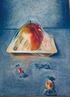
For the opacity project, I think Phoebe did an outstanding job. It really demonstrates opacity, and she did it well. The fact she did it with pastels as well and made it so intricate and detailed is amazing. The thing looks real. The shading on it is really amazing, on the cellophane, and as well as the candy. The colors she used are amazing as well, i love how she used blue in the highlights for it all. She even reflected the blue from the background into the cellophane. Overall this looks incredibly realistic and detailed, looking like a photograph. The colors are awesome, I love how the red of the apple contrasts with the blue so that it brings your eye right toward it. Phoebe did an amazing job with this piece that really shows opacity.
Phoebe's portfolio link: phoebe-apex.weebly.com/
Phoebe's portfolio link: phoebe-apex.weebly.com/
7. Discuss the project you felt you were least successful. Explain why you felt this way. What would you do differently to change this piece? explain.
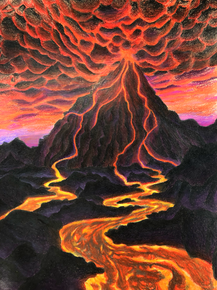
The project I felt I was least successful on was my look at that view project. The project was supposed to show an interesting view of an object but I was unable to portray very well, I was supposed to be looking UP a volcano but it doesnt really look like that, it just kinda looks like you are looking at it from the front view, which was not what the project was supposed to be about. If I could change it I would make the rocks on the volcano more easier to see since you can barely see them in the project, and probably put more purple into them. I would also choose a more interesting view of the volcano in general, probably something cool like looking at a volcano from above since that's a unique idea. I also would redo the clouds of smoke and make them less.....roundy??? i just feel like they are too circular in shape.
|
|
