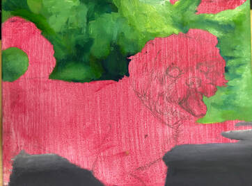
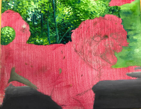
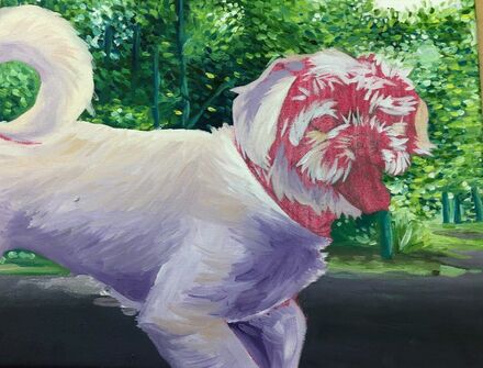
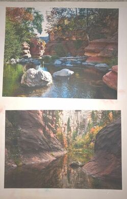
Reference photo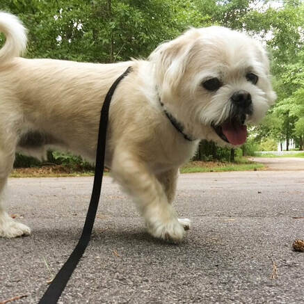 Sketch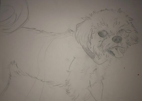 Work in progress photos
 Final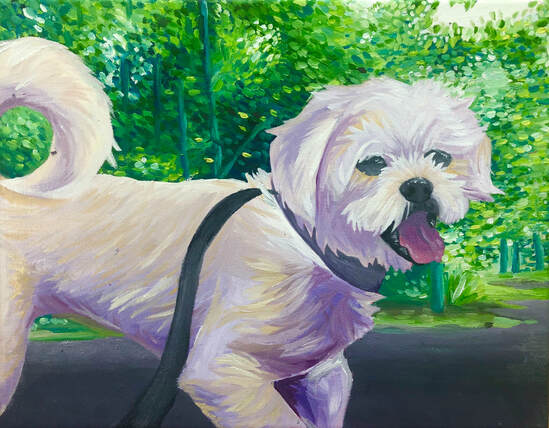 critique questions 1. I think my painting is very vibrant with it's colors. I like how it turned out, but the purple shading doesn't really go with the bright green background. while painting this I found that painting fur is very hard, but i'm happy with how it came out nonetheless, even if it doesn't look that realistic. I really like the color combo of using both yellow and purple in the shading of the fur, I think they go well together. Besides the dog, I put a background. While I am happy with the trees above my dog, I think the trees to the right of him could use some work. I also think the background as a whole does not have much depth and looks flat in comparison to my dog. But overall I feel happy with this piece.
2. I think I was able to capture value in the shading of my dog, and a bit on the trees. I am not sure If i was able to capture texture. When I first started painting I was going to put some texture for the road that my dog is standing on, but I did not like how it looked so I got rid of it. There is a lot of contrast with my painting between the background and my dog though the colors look kind of weird together. To try to make my painting look realistic, I constantly checked my ref photo to look where highlights and shadows are. In my opinion, I think the most aesthetic quality is my painting is the purple shadows, they are just nice on the eyes instead of using regular black or greys for shading. 3. I tried to lay down base colors as a technique before adding all the details on top and this made stuff a whole lot easier, like the fur and especially the trees. At first I was really unsure how to go about painting the trees in the beginning so I looked up a tutorial video, I am happy with how most of them turned out. I also tried thin brush strokes to for the fur using white most of the time. Another technique I used was painting the background first. This really mad it easier when it came to painting my dog bc I didn't have to avoid some spots or anything really. 4. I think this painting really shows my growth with oil paint as a medium, when I first painted those oil pears I didn't really know what I was doing, and everything blended into each other but with the last few paintings I have gotten to learn a lot it. I admit I was afraid I to start painting my dog but I eventually just got into it and it became easier the more I went a long. 5. I think this painting turned out overall good in my opinion, it looks pretty clean overall, the mistakes that are there can still be overlooked for the most part, and I think it is a great commemoration to my dog, Cookie, since he is getting really old (13 years)
0 Comments
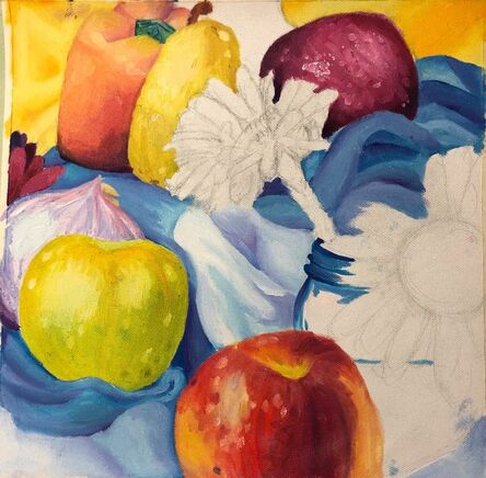 For this assignment, we had to paint a still life using oil paint. I was not able to finish it and feel that there are a lot of problems with it, like not proper shading in a lot of areas.
ref photo ideas
 compostional sketches/final sketches
work in progress photos
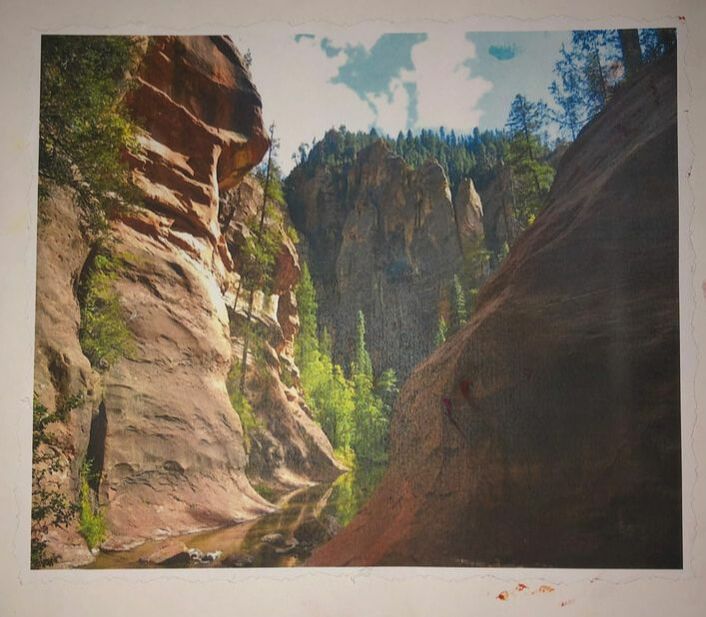
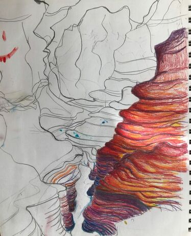
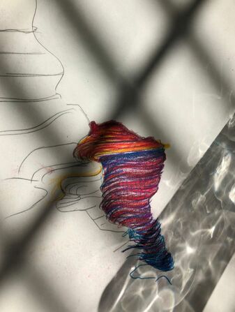
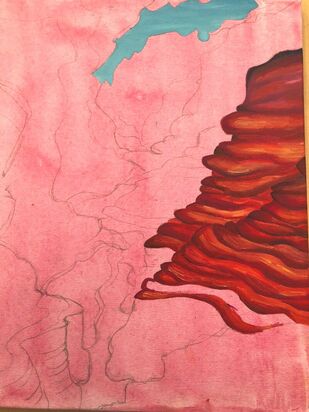
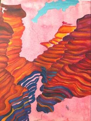
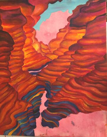 final painting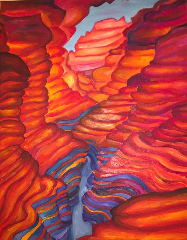 critique questions 1. I think that my craftsmanship was okay for this painting. I feel like it could have been a lot better. I did not really know what I was doing in this painting. And it took forever to complete, longer than it should have. There is a big mistake that I think causes this painting to be bad, which is that its really hard to distinguish rocks getting further away from you. I think I will fix it on my own time maybe sometime next semester, but I just do not have the time to fix it now. The lack of change In the mountains makes it really hard to be able to tell what the painting even is of. It is supposed to be like a valley canyon thing that was cut through from a river. I feel like i should have planned better for this painting.
2. For my choice of colors, I mainly used red and yellow. So much so that I think it is a bit overpowering. I would want to go back and add more pink into the rocks but I do not have time, I am just glad I was able to get paint on the whole canvas. To combat the enormous amount of red and orange, I tried to make the rocks in the crevice blue and purple and a few streaks of colors from above. To try to convert distance in the painting, I tried to make the rocks further back have less red and more pink, and I wanted to put more pink but the painting was not dry enough at the time and the pink would just blend into the colors already there. 3. I don't think I put enough contrast in the painting. I tried to put a little with the blue sky and the blue rocks but I feel like the orange color is still to overpowering even with the little blue that there is. So no, there is not a lot of contrast in the painting. 4. For this painting, I tried to make it streaky to make it have like a griddy rock texture vibe, and while it did work in a few areas, I don't think that there was enough of it, or that it really made an impact to the painting. For highlights in the rocks, I used bright yellow streaks, which I like and doesn't make everything look so blendy. As for shadows, there are not really any in the piece, I mean I tried to shade the uh- idk what you would call it- layers of the rocks but they look more like outlines than shading. 5. I tried to create depth within the painting and make the rocks farther back look like they're farther away, but I'm not sure I had as much success as I would want. I would have wanted them to get unsaturated in color and more pink as they get farther back but because the paint was too wet, I could not put bright pink without it blending into the yellow. So no, I don't think there is enough depth in the painting. 6. I think when I first started the painting, I used techniques. I worked in light layers to thick layers, i was trying to be detailed, but it was taking too long, and I had to get this thing done. (which is why the rocks on the right side look better and more detailed than the rocks on the left side.) Towards the end when I was just trying to get it done I was using think layers and everything blended and I had a lot of problems putting other colors down :( I think I did have some good blending in some areas, though. 7. I had difficulties getting the colors I wanted down. I should have been working in light layers but I was actually working in really thick layers which caused it to take forever to dry, meaning you could not really put highlights anywhere while the paint was wet because it would just fade in. I also had a lot of difficulty managing my time for this painting, I spent a lot of nights staying up till 1 AM trying to finish this thing, I need to be more productive and faster in my opinion. to improve this, I maybe would make it more realistic, I think I would make the rocks that go into the distance a different color maybe darker so that you can distinguish each one from each other and there can be depth in the painting. 8. I think I was o-kay on this piece. I'm not sure you can tell what is in the painting without being told what it is which is bad. I think that the orange, red, and yellow are too overpowering in this piece. I don't think that depth is portrayed very well in this piece. I do like how some of the rocks look for the most part, and the pink but I feel like a lot of the stuff in the painting looks too flat because there is not enough shading or any shading at all. regular pear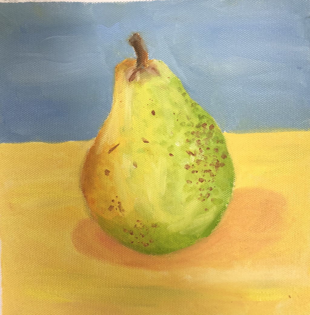 palette knife pear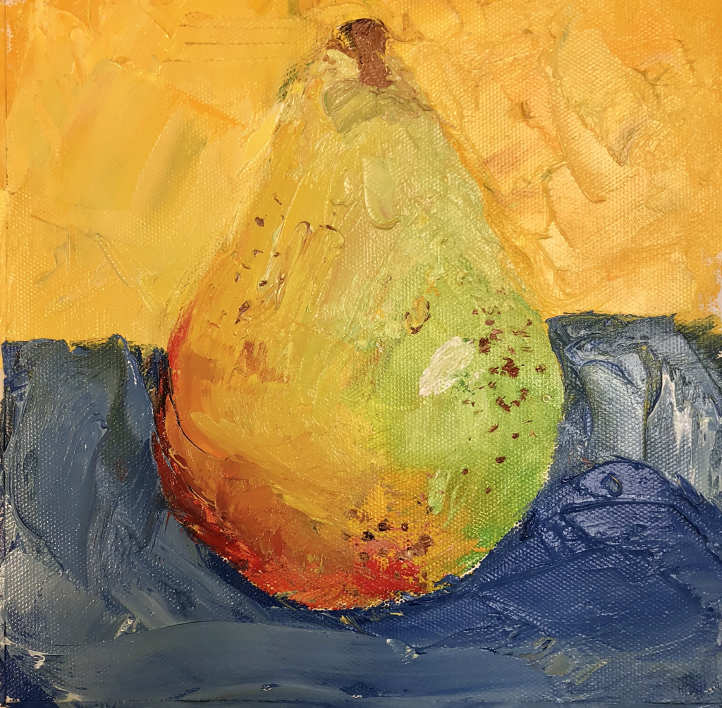 .for this assignment we had to draw a fruit from life in oil paint, using regular paint brushes and palette knife. It was really hard since it wouldn’t dry. Using the palette knife made it hard to control where the paint went
Idea photos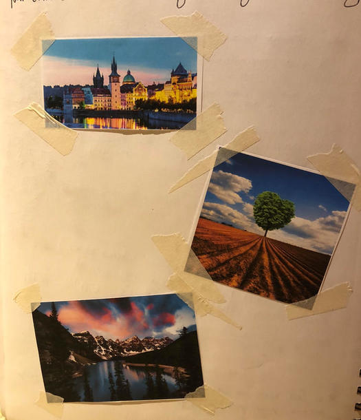 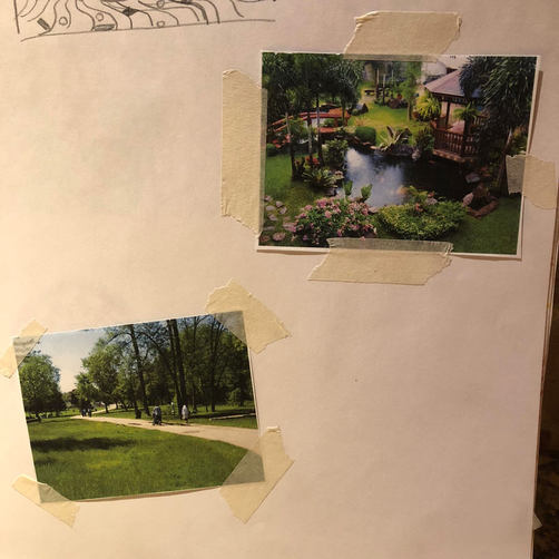 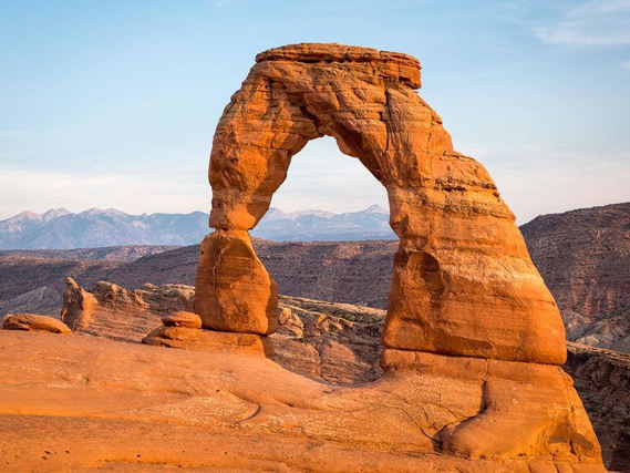 Compositional sketches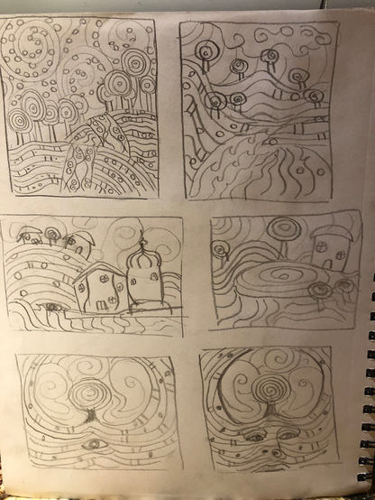 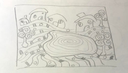 Final colored sketches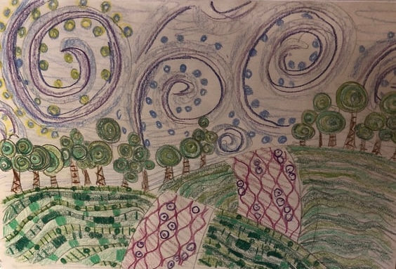 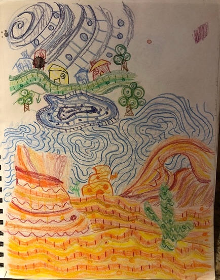 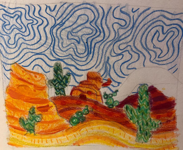 WIP photos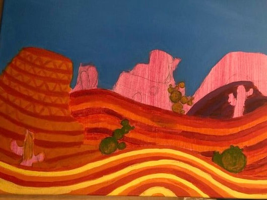 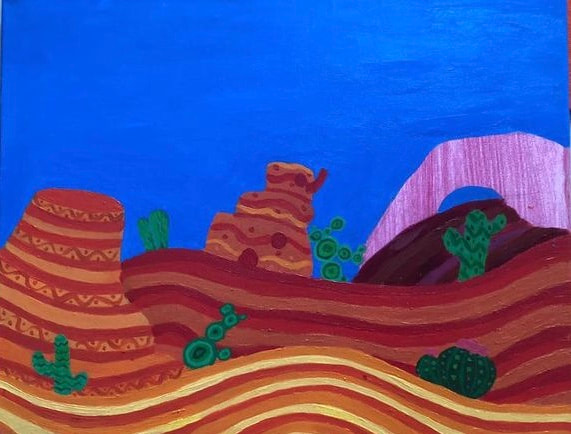 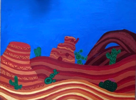 Final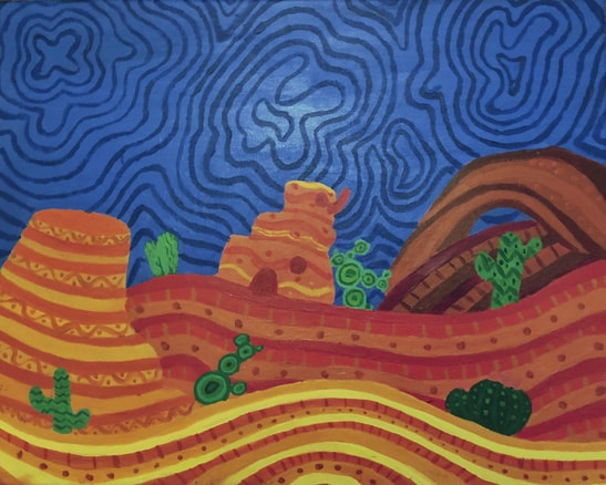 1. I think my craftsmanship of the painting is neat. I am happy of the way it came out. I tried my best to make the lines in the ground neat and nice to look at, and I think it turned out well. I think it is excited ehhh okay.
2. The flat colors definitely are a part of his style, including the lines in the ground as well has the layers in he ground. I also included swirls in the sky and patterns ffor his style. He had lollipop swirl trees which I tried to include in some of the cactuses. The colors are also bright which happens in his style and there are no straight lines. 3. I feel like my painting doesn’t really have a focal point, but if I was gonna pretend that there was one it would be the little desert house. It’s kind of the center of the piece. 4. My colors were chosen to be bright just like his are. The sky and the landscape part of the piece contrast and have a nice effect I think. In the layers I had to make it look like they didn’t blend together bc when I first sketched this out they kind of did. So I made them rlly dark so you are able to distinguish between them. 5. I used a lot of patterns through out the piece, I used them in the rock in the side, on the ground, in the arch as well as on the house. I also tried to use them on the sky so it wouldn’t be blank blue. I think they gave the painting something to look at and see. 6. I didn’t have time to put a border in my artwork, sorry ms rossi :( 7. I had a BUNCH of difficulties in this painting. It was so hard to get it to look neat, especially the lined parts on the ground, I had to redo them numerous times. It was also hard to get the colors right everywhere. I also had to redo a bunch of stuff such as the rock on the left bc I mixed colors that were too dark. Compositional sketches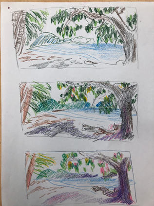 WIP progress pictures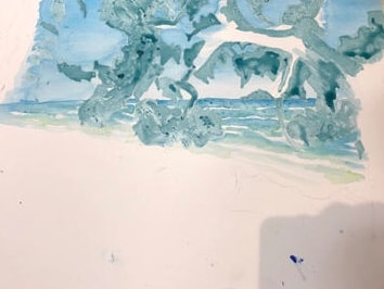 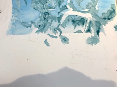 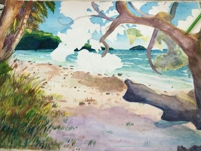 Final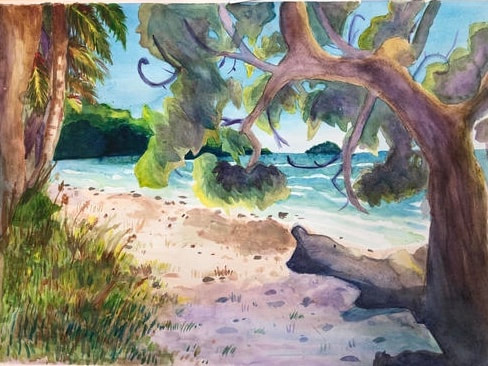 1. The watercolor techniques that were effective in my painting were definitely washes, I used it a lot through out my painting. And they give the painting a sorta transparancy. Another technique I used was looking for different colors in the photo, making it colorful.
2. Very important, to keep that watercolor ish vibe. And to build up colors and paint. There are some spots in the painting where I went a little too dark bc I didn’t have enough water on the brush, such as the trees in the background on the water. 3. I feel like the composition was semi successful. I wish you could see more of the water but the tree pretty much blocks it. I wish I could have simehow moved the tree over a bit so you could see the water. I don’t think I utilized all the principles of art and design, I think the tree kind of unbalances the piece. 4. Yes I think it was very important. I tried to go with bright colors and lighter colors you did not see such as purple for shading the darker areas, And it worked out well I think. Maybe even a little too colorful. The colors makes it bright and appealing to look at. 5. I think my craftsmanship was okay, I was able paint the painting but I had a little trouble getting some areas down like the leaves on the big tree in the front. And I do not like the grass. I wish I could have toned it down a little. 6. I would want to definitely change the leaves on the tree and the grass, I think the leaves don’t look like leaves and blend into the island in the background a little too much. As for the grass, the grass looks messy and like a big blob. I wish I could have done lesser strokes in the grass. 7. I have learned ALOT about watercolor. At first I didn’t know what I was doing, I didn’t use light layers at all and it was rlly hard. But I learned you have to use light layers and build it up. I have also learned that you can’t really control watercolor, if just does what it wants. At first I was fighting it but you have to work with it. 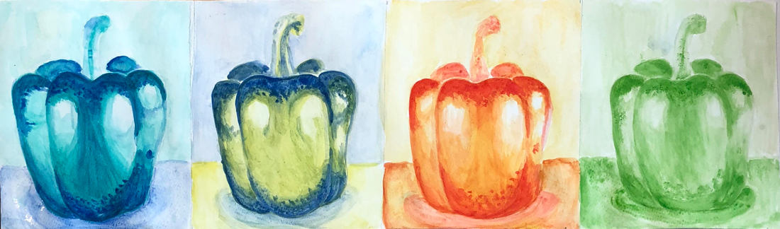 For this project, we were supposed to choose a fruit or vegetable and paint it with different colors choices given to us. I chose a pepper! For the first one on the left, i used cool colors. For the second one I used complementary colors yellow and blue. For the third one i used warm colors, and for the last one i used monochromatic colors.
Value Chart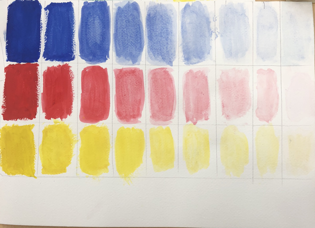 In this assignment, we made a value chart with water color. For me it was really hard to make the chart descend into lightness, and making each box slightly lighter then the next Watercolor techniques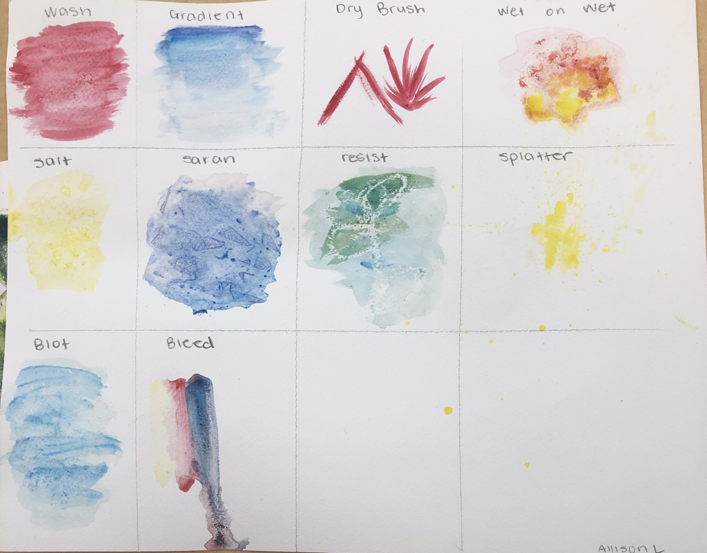 In this assignment, we were shown water color techniques and were supposed to recreate them on our own paper.
    (I don’t know how to resize images)
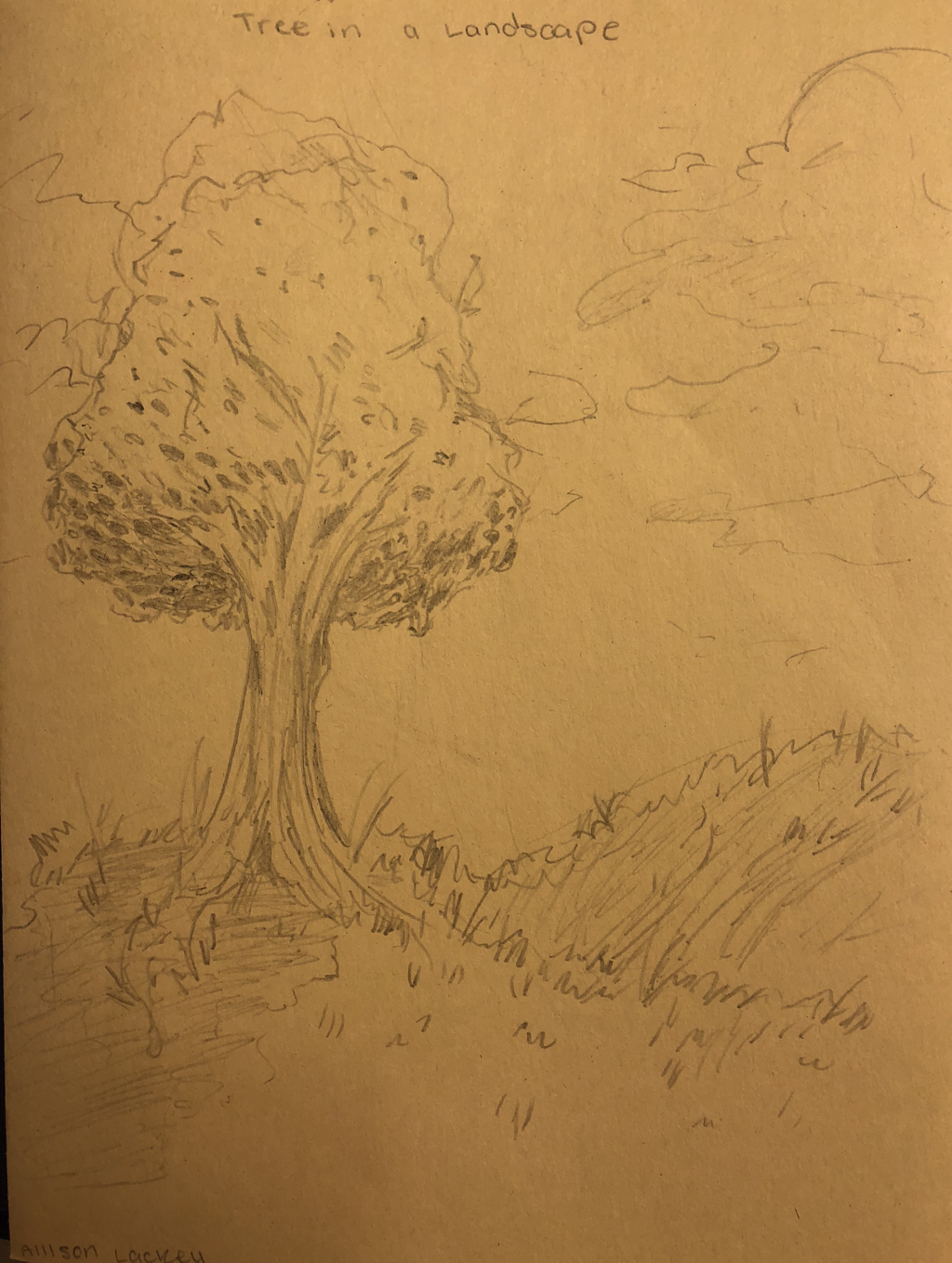
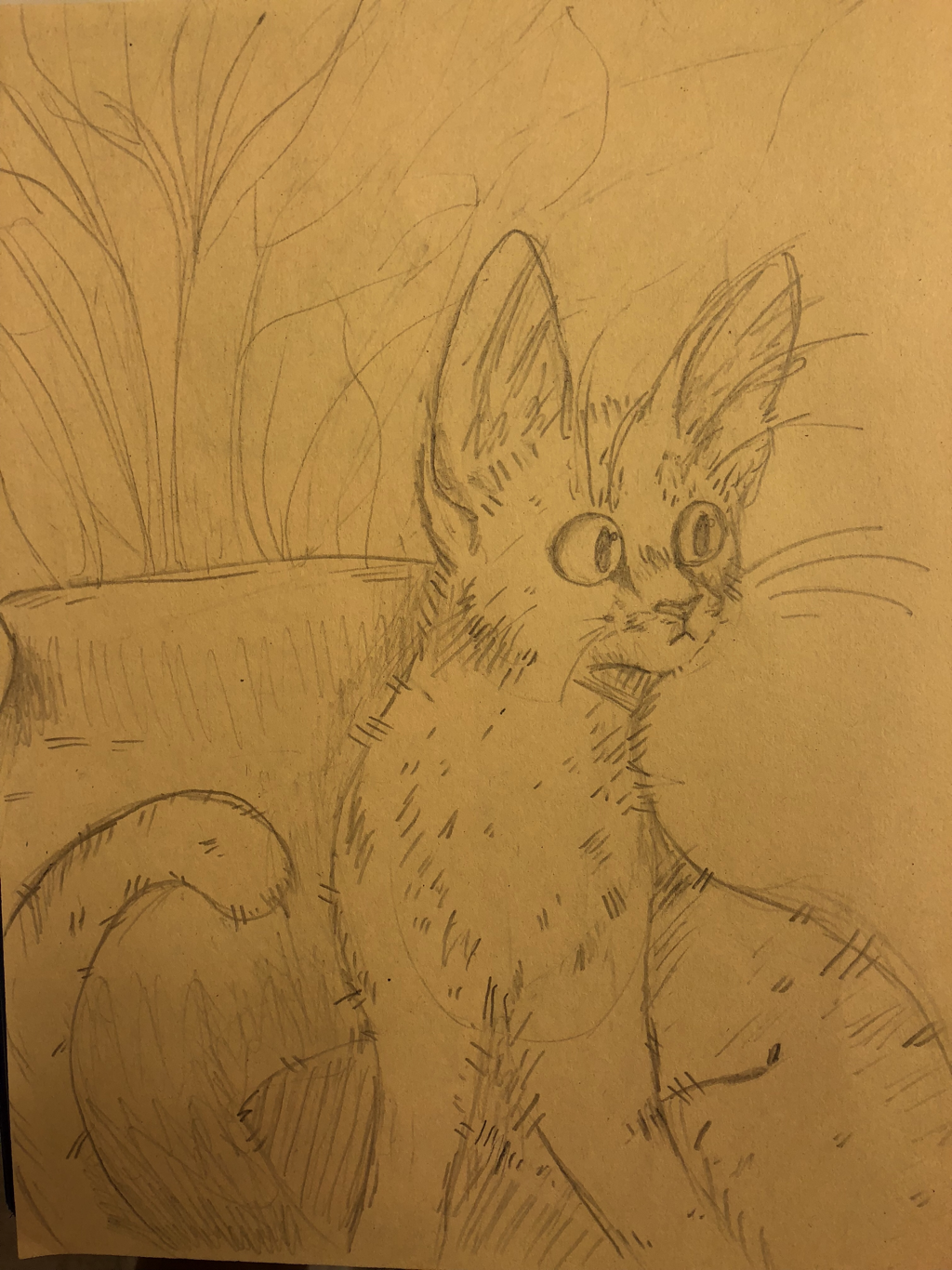
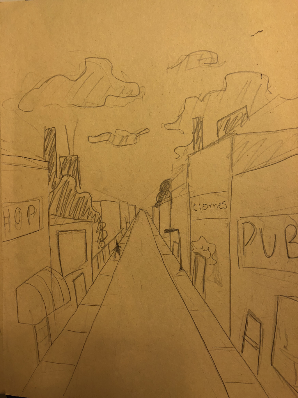
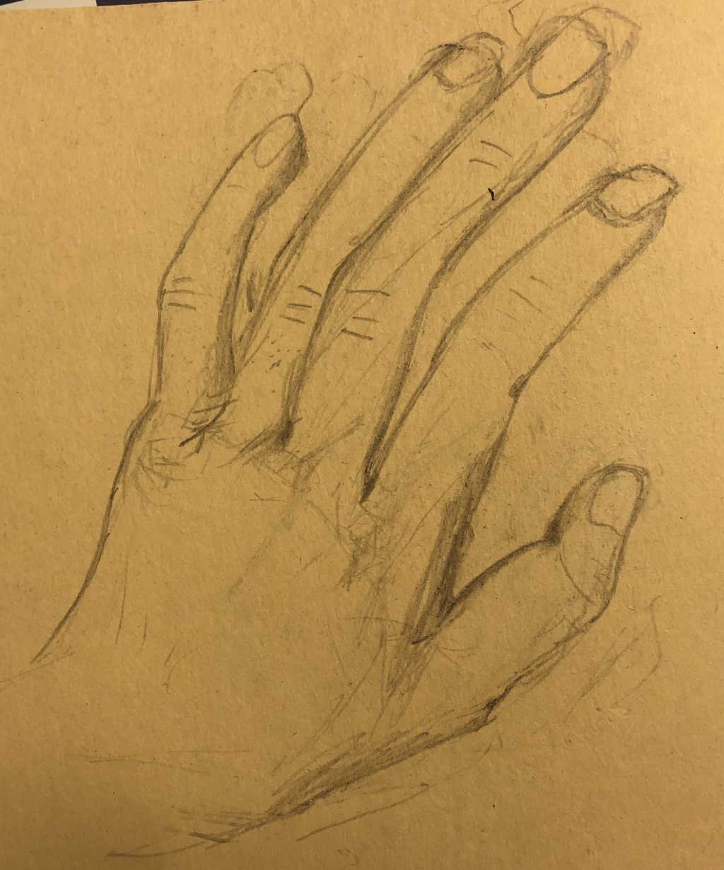
in this assignment we had to draw a tree in a landscape, an animal, a road with first point perspective, and a hand. I think I did okay on the first two but I don’t really like the road and the hand. Watercolor pen practice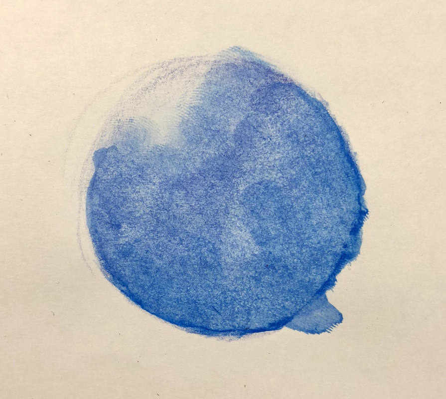 (i still don't know how to resize images) For this assignment we were supposed to draw and shade a sphere using water color pencil and then take a paintbrush with water on it. This didn't really turn out very well as I think i used too much water. Colored pencil practice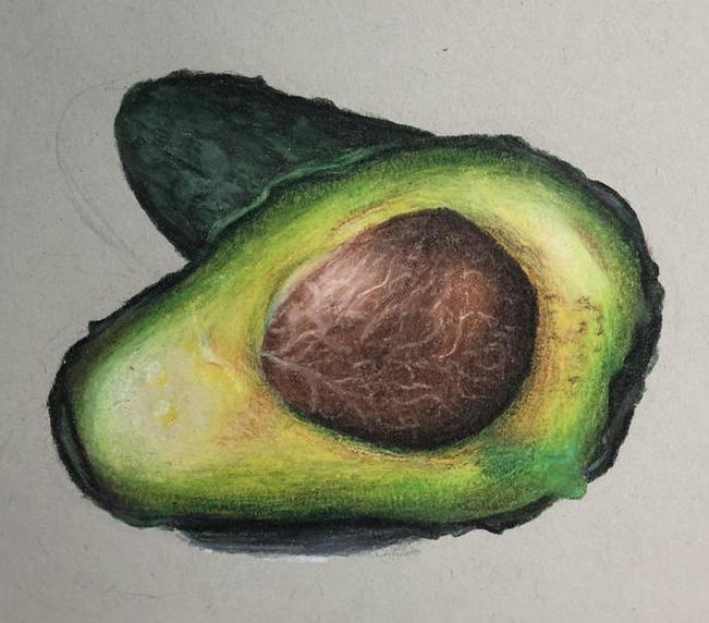 For this assignment we were given an image of a fruit or vegetable and were supposed to draw it using prisma colored pencils. I think it turned out okay but i do not like how streaky the colored pencil look.
|