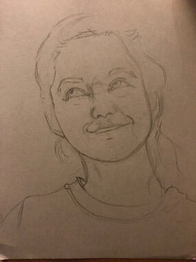
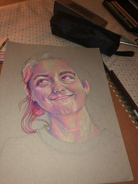
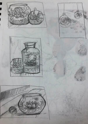
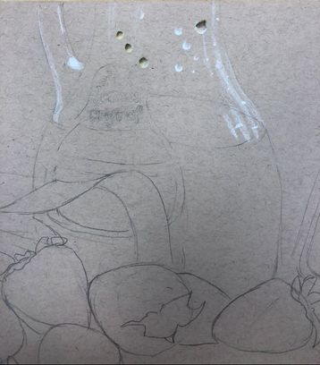
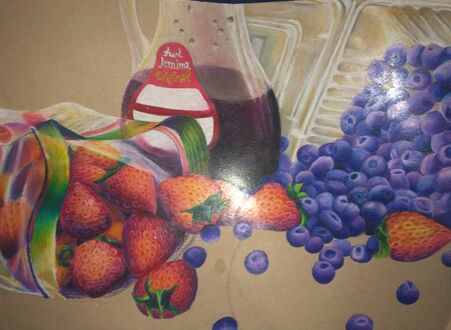
work in progress shots
final photo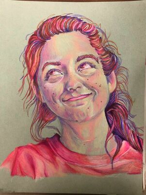 critique questions1. For my process, I just tried to perfect the facial anatomy as much as I could before moving onto coloring. It took me like two hours trying to perfect it but I knew that it would impact the whole drawing and may not look like me if If I didn't do it. It was really frustrating because I had an initial sketch but I was scared I was going to mess it up so I was afraid of redrawing the whole thing to correct proportions.
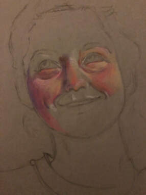
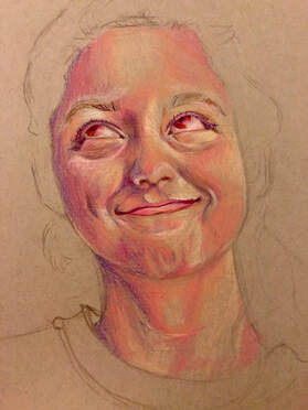
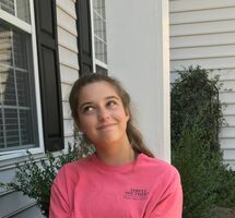
2. For the values, I really tried to pay close attention to my reference photo for every shade. I constantly looked back and forth between the reference photo. I also wanted to incorporate pinks and purples into my artwork but it really just turned into mainly purple, I kind of have a problem because I love shading with pink and purple so much. 3. Not really, I colored REALLY LIGHTLY because i was scared I was gonna mess it up. I feel like I should go back and put down more layers but honestly, it does not look too bad with the light layers. I might go over it in the future. 4. My craftsmanship was ehhhh okay. I kind of winged this to be honest, not really a lot pf planning went into this, I tried to get it done quick because I was running out of time before we had to take exams. If I could, I would go back and plan properly, and learn how to draw hair bc it looks really stringy. 5. By two hours of perfecting facial proportions. I admit when I first started coloring it looked EXACTLY like my mom when she was young so much so that that's all I saw when I looked at it. I was kind of sad bc it didn't really look like me, but when I put all the flyaway hobo hair afterwards and the moles on my face, it looked more like me, so i guess those are my two recognizable features heh. 6. I really tried to measure with my eyes on the proportions of the face. Using the facial chart with measuring eyes to see how far the mouth was from the nose was pretty helpful, so I also used that technique first and drew verry lightly. 7. Learning how to draw all features individually was very important because I need to know how to shape them, and what and what not to do when drawing. That is why those videos we watched was very very helpful for me. 8. The most beneficial part of the unit was learning the facial placement charts. I know whenever I am going to have to sadly draw another human, I will look at that chart and measure So that everything looks more proportional. 9. Obstacles I had to overcome was drawing the hair. Not gonna lie, Had to improvise and make my way through it, and even then it still looks like multicolored spaghetti growing off my head than actual hair. I need to learn to put more value on it. I also would change the eyes, if you look, one pupil is bigger than the other and I hate that. They also need more highlighting in them and more.. eye lines? im not sure what to call them but nonetheless I got impatient while drawing them and pushed to hard so I had to push RLLY hard to get those tiny highlights in.
0 Comments
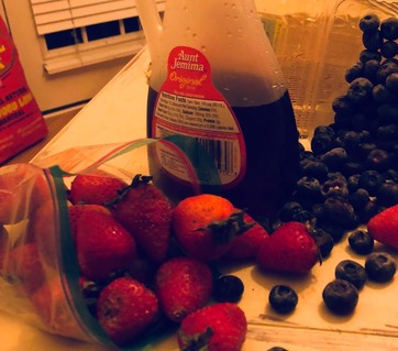
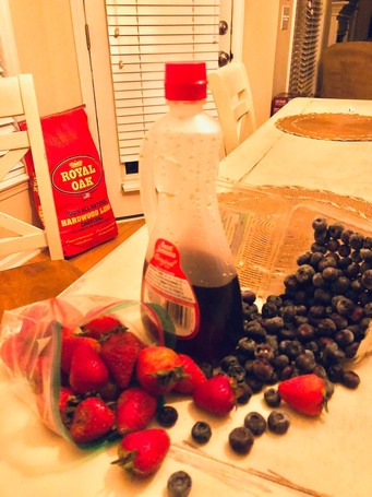
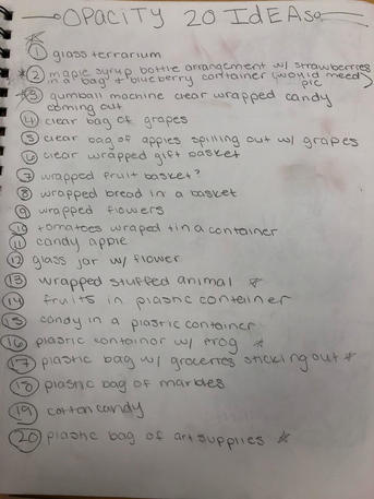
brainstorming list reference photos
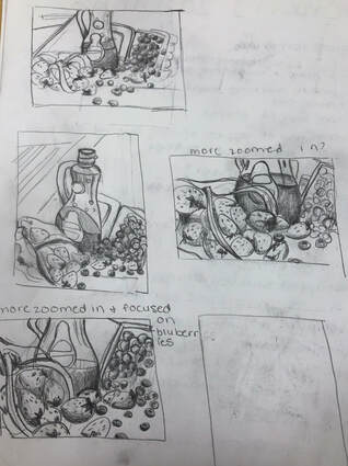
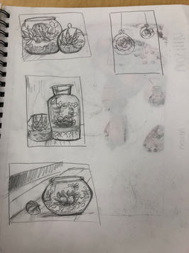
compositional sketches
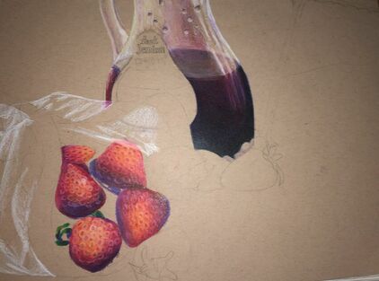
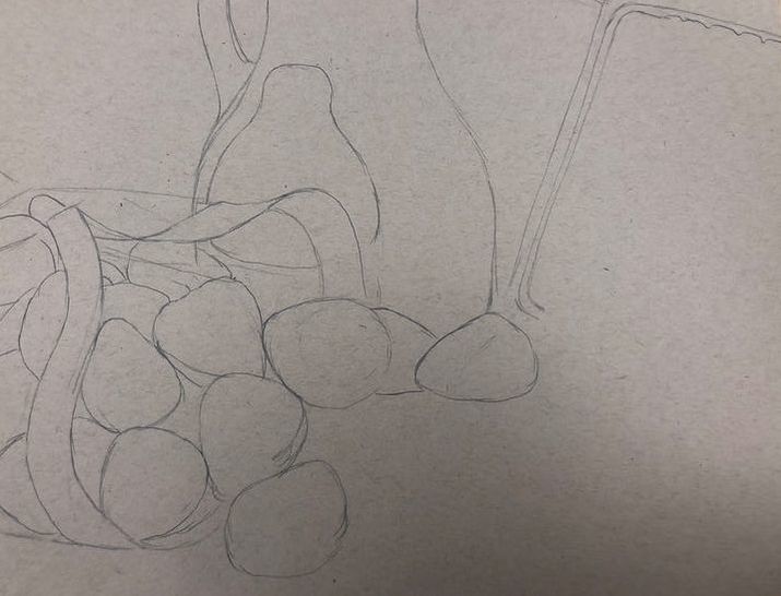
colored sketch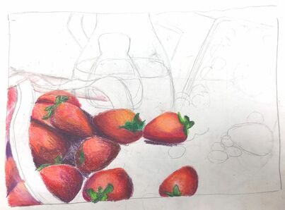 in progress photos
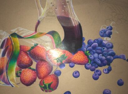
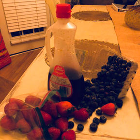
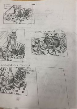
 final drawing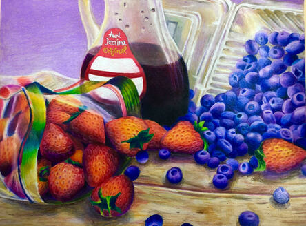 critique questions1. I used prismacolored pencils to make my drawing. I think that it looks fairly neat in some places like the syrup in the syrup bottle, and in others not so much. especially in areas where it's supposed to be see through, like the blue berry box.
3. I like my choice of colors in this drawing, i think they help distract the viewer from the imperfections a little bit :) I really tried to push my colors in this drawing, maybe even a bit too much (like in the strawberries heh.) I tried to use purple, my go-to color for whatever reason, to make the darker parts instead of them just being plain black, which I like how they came out. 4. I'm not sure if there was much contrast in my art piece, I think that maybe there is a little bit between the red-orange strawberries and the blue blueberries, but everywhere else, not so much. 5. For this drawing, I really tried to show the textures of the strawberries in the seed area because I didn't want them to look smooth. For highlights on the plastic parts, I mainly used white, but for the strawberries I tried to use this yellow orange color. For most of the shading, I used purple because I really like it as a shading color, and I think they turned out nice. 6. I had help from the class to decide which background color to use, and ms rossi and the class said to use a light purple. I think it helps balance the blue berries that are on the right side with the left side where there isn't that much blue. I also put the items on a table to give them more depth and so I could apply shadows. I tried to put a lot of different colors into the wood, some similar to the ones above such as the blue and purples. 7. It is very important to understand the media because It will affect your drawing. I used prismacolored pencils in mine. Sometimes I would have issues where I had a color fully furnished in an area where I forgot i would have to put a highlight there, so i had to press REALLY HARD with white to get it to show up. So I definitely think with colored pencils you should put your highlights first before anything else. I also think it was important to understand blending in the piece. I had to blend a lot of colors in this piece, especially in the strawberries and the syrup bottle. I think blending should be fluid and equal, which I tried to show in my piece but some areas didn't quite have it. 8. I had A LOT OF DIFFICULTY with time management in this piece, I was so slow on working on it. I could spend 45 minutes on it and only get 5 blueberries done. I was such a perfectionist in this piece that it took me soooooo long to do everything. I think what could improve my drawing if I did better on the the plastic areas, I think they don't really look like plastic and could use more blending (especially on the blueberry box.) I also hate the proportions of the blueberry box and wish I could fix those. Facial features placement drawing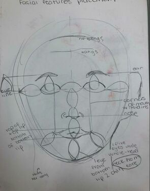 WE PRACTICED DRAWING FACIAL FEATURES AND THEIR PLACEMENT ON THE FACE. WE USED MEASUREMENTS SUCH AS EYES AND LABELED THEM. eye practice
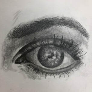
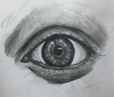
in this assignment, we first had to follow a tutorial video and draw the eye with the artist (1) and then we had to draw our own eye (2) nose and ears practice
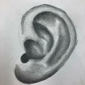
For these two assignments, we had to draw our own nose. For the ear I just followed a tutorial online. lips practice
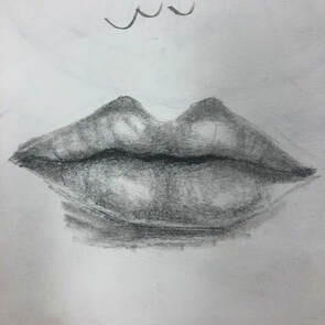
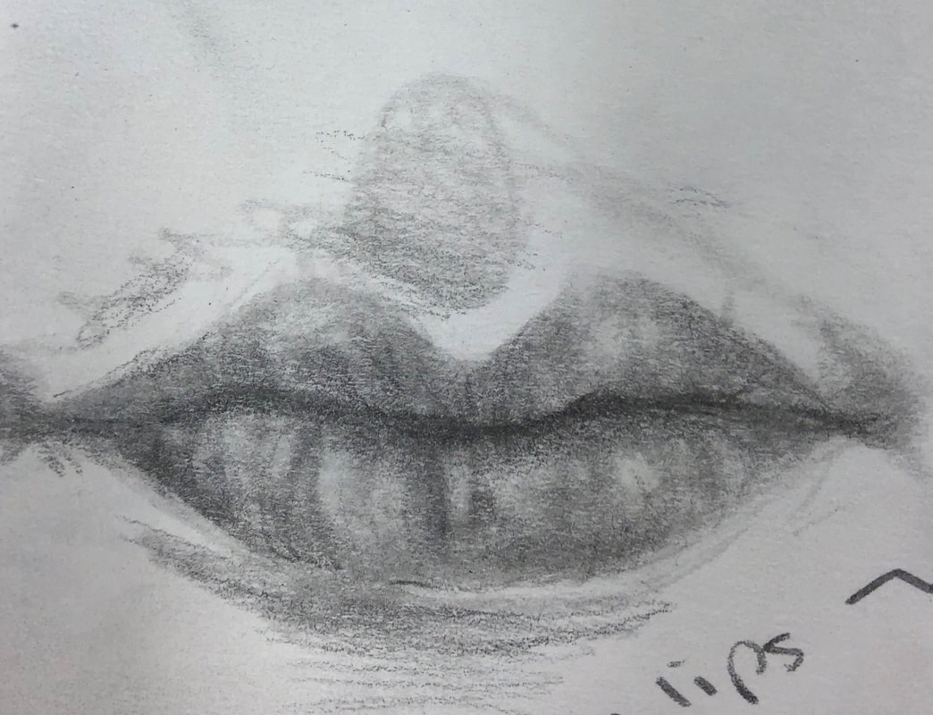
For this assignment, we had to draw one set of lips following a tutorial and then our own lips.
Smarties drawing 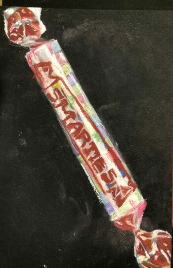 For this assignment, we were given one wrapped piece of candy and had to draw it using pastels or colored pencils. This was so we could practice drawing wrappers. I decided to use pastels but i'm not sure I like how it came out. Lots of candy drawing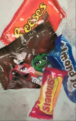 In this drawing, we had to use pastels to draw an assortment of candy from life. I wasn't able to finish. I didn't really like using the pastels because they would just smear everywhere.
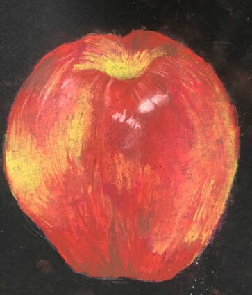 in this assignment, we were given a fruit to draw from life but we had to use pastel. Unfortunately, i wasn't here for one of the days we did this so i only could draw it once just using the regular pastels instead of the pastel pencils.
ideas compositional sketches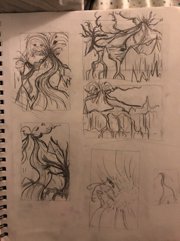 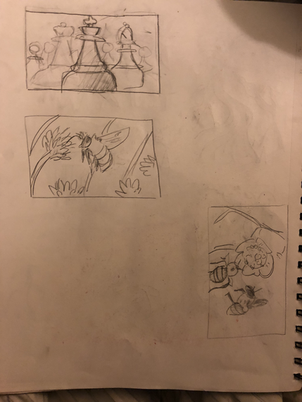 reference photos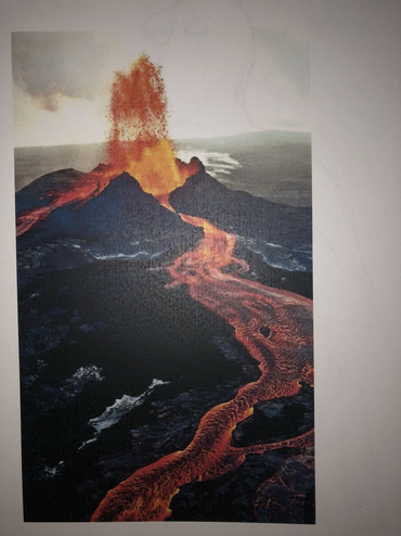 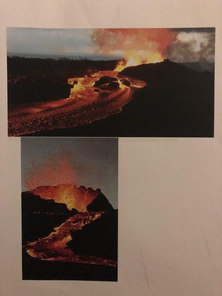 colored final sketch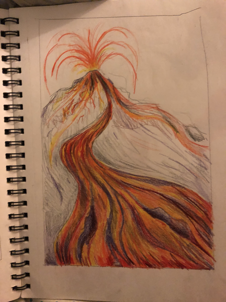 WIP photos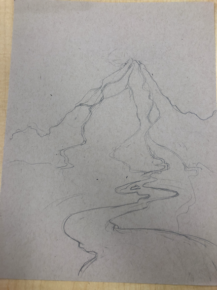 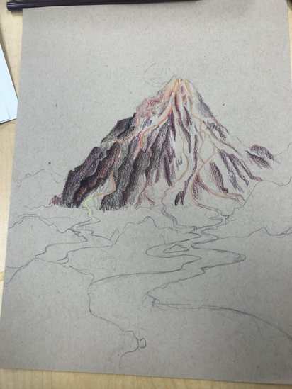 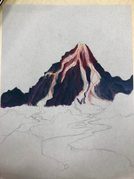 final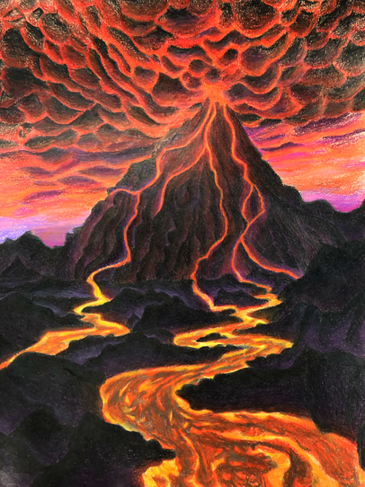 sorry Ms Rossi I was unable to finish. I worked on it all last night but accidentally fell asleep during the time. I definitely will have it done before the critique on monday, I just couldn’t get it done before this post was due. Sorry :( 1. My idea was “looking up at a volcano.” Now I sketched a few drawings out but I didn’t really like how it looked, I think it needed a little more landscape. So now in the final I’m unsure if it’s actually “looking up” more like looking at one, but even so I like how it looks with the included landscape more.
2. Because perspective is everywhere around us, everything we see is in perspective. It’s important to be able to draw it so we can make drawings look more realistic just like real life. 3. The colored pencil exercises taught me how to blend colors better. Which I need a lot in this piece. They also helped me with shading and pressing down hard and not too. I also learned about building up your layers. 4. I built up my layers on everything. Which was very time consuming but I am more or less happy with how it came our. I also looked for colors that weren’t really there such as including purples in the piece. 5. I think by adding in the landscape, yes. I was not able to but in the sky so I’m not sure about background but definitely foreground and middle ground. I think adding the landscape added depth, like you’re taking a step back from the volcano. 6. Obstacles were definitely that it was time consuming to build up all the layers and to make it look nice, so much so that I didn’t finish heh. I also had trouble doing the rocks, it’s hard to texture them so I just layered them a whole bunch instead. I’m also currently having trouble coloring the clouds since I don’t want them to be to colored. 7. I feel like I was prepared for this project except for how long it is gonna take. I wish I new how to draw lava and clouds, I just kind of had to reference a whole bunch of images. I spent a lot of my time trying to draw lava. 1 point perspective room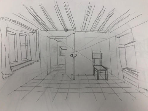 city 2 point perspective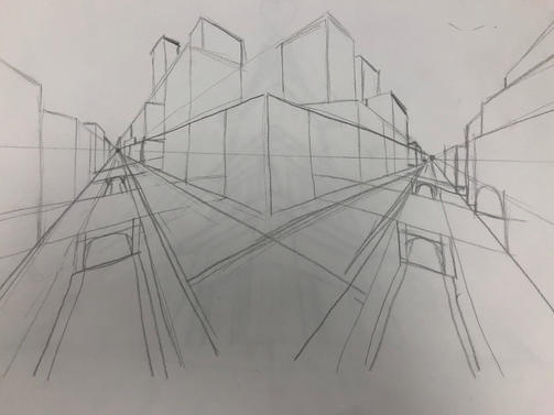 3 point birds eye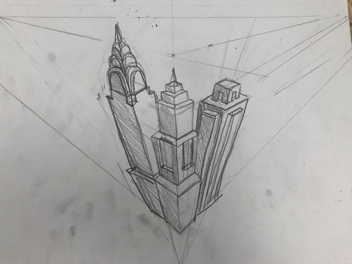 3 point worms eye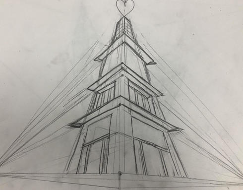 In this assignment we followed videos drawing tutorials about perspective in class. I found perspective to be really hard, if you messed up one line, it would mess up the whole thing. If you look in my worms eye you can see it be kind of lopsided because I messed up, and nothing is really even..
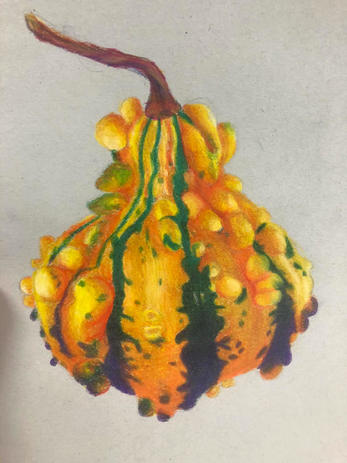 In this assignment, we had to pick out a photo of a fruit or vegetable and draw it with prisma colored pencils. We also did this before in painting class, but this time I tried to look for colors that were not actually there such as the purple at the bottom.
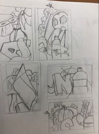
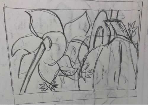
6 compositional sketches
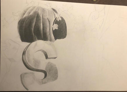
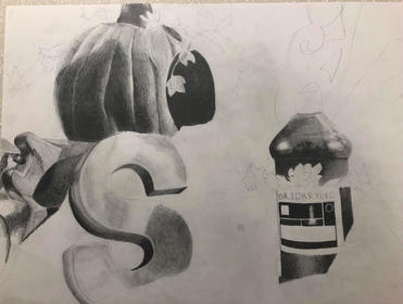
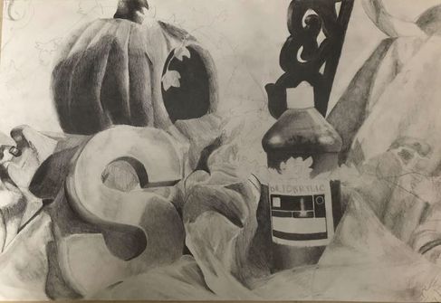
WIP shots
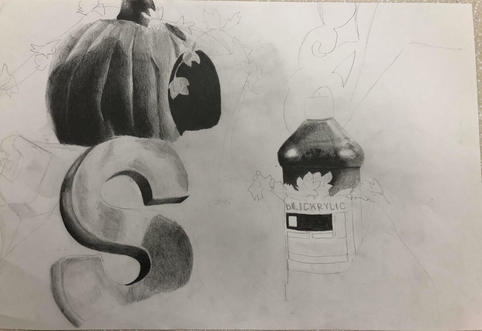
Final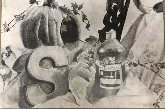 1. I think that overall the drawing is okay. I think it's easy to see most of the objects and has pretty clean edges overall, except where the bottle blends into the fabric. There are also a lot of smudges on the fabric on the right side that I haven't erased. I wish i could have gotten rid of the white space in the background but I did not have enough time :(
2. I think my values are realistic for the most part, I tried to include as much value range as I could so you could distinguish the objects easier (exaggerating shading, etc). I do think the values on the telephone on the very left could be improved a lot more. 3. No there isn't really a clear source of lighting in my drawing, the lighting and shadows are kind of everywhere. 4. The compositional sketches were important because they helped me figure out which composition would be most appealing to the eye, and helps guide your eyes around the artwork. 5. I think my final was okay, i'm happy with how it came out but there are a lot of areas i wish i could change if I had more time, such as the fabric in between the big "S" because it is hard to distinguish the different folds. I would also like to add a background, not just plain white. The folds on the fabric on the very right side of the artwork. I think the drawing as a whole looks kind of smudgey to me as well. 6. Overall I think the proportions on my final were okay except for the big S. The shape doesn't quite look right to me, I think it is because of the sides. I did have trouble shading them and trying to get them right but it still looks a little weird. 7. I think it does create a pleasing arrangement for the most part, though there wasn't really a central point or main point in the piece. People told me that the first thing that caught there eye was the bottle however, and their eyes moved onto the pumpkin and all the other different things. 8. As I said before, I didn't really have a center of interest in my drawing (or at least it was not intentional) But people did tell me the first thing that caught there eye was the bottle. 9. My time management was meh, I had to stay up the night before it was due to work on a few parts at home, I do think I spent wayyy too much time on certain areas such as the pumpkin and the big S that I could have used working on other areas that needed it, such as the fabric. Maybe instead of doing one object at a time and shading each in full value i should have done a light layer everywhere first and then went back to darken it up. I also found myself procrastinating on hard parts in shading such as the big S, I would work on it a little but quickly move onto a different object because I wasn't sure quite how to shade something. 10. I think the biggest challenge for me was shading the pumpkin, It was very hard to get the blending on that thing right so it did not go from light to dark too fast. I think with enough layering I was able to accomplish it, though it did take a lot of valuable time. The highlights were also hard to do but I am happy with how it came out. 11. I learned that drawing a still life is hard. It is hard to find a good composition and to get the values just right and consistent everywhere. I also learned that it is good to exaggerate you values if it helps you distinguish and make clear different objects. I think drawing this still life definitely helped me with my blending as well. |